With the launch of the Pixel Fold and Pixel Tablet, Google is looking to make the most of all that additional screen space Android users will gain. Many apps will simply stretch things out in order to fill this extra space, scaling to a higher resolution without much in the way of optimization.
However, in a recent Keyword blog post, Google has laid out three core design principles for making apps look better than ever on big-screen devices with some impressive results already on display.
How to design great apps for big-screen devices
The first thing Google sought to do is make use of two-pane layouts. These layouts not only make use of the additional space on tablets but also give a distinct experience to foldables in particular — with devices in unfolded orientations presenting like an open book.
The next thing Google made sure of was that each app could easily transition from folded to unfolded orientations without losing any accessibility or functionality. This allows apps running on a bigger screen to gain more space to present more detailed information without penalizing their functionality or overall experience on a smaller screen.
Finally, Google made sure to keep responsive layouts in mind at all times. This is to better accommodate tablets of all sizes and multitasking features that allow you to use two apps at the same time in either a horizontal or vertical split-screen. Because of this, apps need to be able to dynamically scale in size to fit the content boundaries permitted.
5 incredible looking apps on Android tablets and foldables
Google I/O 2023 saw Android announce that over 50 Google Play Store apps had already been optimized for larger displays, with many more on their way. Recently, Google hand-picked a selection of their favorite apps that closely follow their design principles for foldables and big-screen devices, and it’s quite a selection.
The following list contains (in no particular order) all of the apps that Google has earmarked for their impressive big-screen potential on Android tablets and foldables.
1. Google Keep

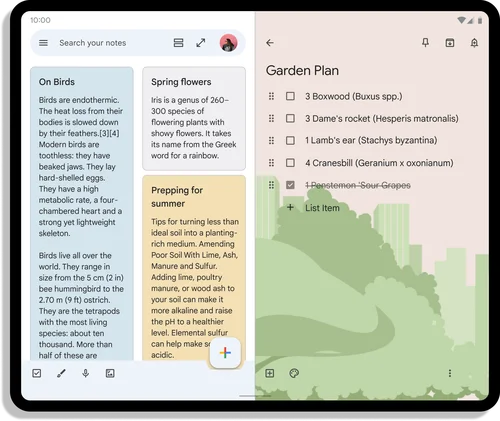
Google Keep is a notetaking app for Android devices that lets you quickly capture your ideas through writing, drawing, or automatically transcribing voice memos.
In its regular form, Google Keep is much like any other notes app with a collection of notes you can scroll through, organize and edit in full screen. It’s all pretty standard fare, just with a very minimalist-heavy Google design.
However, open Google Keep on your Pixel Fold and you’ll encounter an entire second pane dedicated to showing your selected note in full — giving you free rein to edit, amend, or customize your entries without having to switch between screens.
2. Deezer

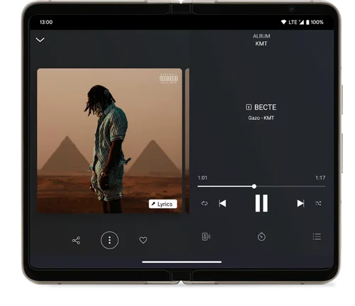
Music and podcast player Deezer is one of the most popular streaming platforms on Android featuring a massive music catalog, themed playlists, and even music quizzes to enjoy. The regular Deezer app is already impressively designed, offering a bright and colorful user experience that’s quick and easy to navigate.
On the surface of things, there wouldn’t be much more Deezer would need to do to optimize its app for foldables and larger screens. And, while that’s true, it didn’t stop the company from going the extra mile to ensure users got the optimal experience when listening to their favorite tracks on the app.
Now when playing music, Deezer splits the screen in two, offering a much larger look at an artist’s album art on the left pane along with options to share or favorite the songs you love, while on the right, lyrics to the track currently playing are displayed with the app’s familiar media controls.
3. LINE

LINE is a messaging app that combines all the things you love about social media platforms like Snapchat and Instagram with a hefty portion of WhatsApp for calls and messages.
The app lets you host video calls, create avatars, make use of photo filters, and even use mobile payments with the LINE Pay feature. It has a little bit of everything in an easy-to-use and familiar package.
When adopting to the new big-screen format, LINE took what it had learned from its designs across other platforms and went with a two-pane desktop-like experience of having contacts on the left pane and conversations on the right.
The new layout allows users to quickly switch between chats with a single tap, taking all the hard work out of juggling in and out of screens to read and reply during busier moments.
4. Google Weather

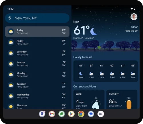
Android users can access Google Weather through the widget or by tapping the temperature on their device’s home screen. It’s a staple of the Android operating system and gives users a quick glimpse at the current forecast and upcoming weather conditions.
Google’s weather app has been updated to maximize the larger displays of foldable and tables by one again employing a two-pane design. The left pane of the app now shows your location and a ten-day weather forecast with estimated temperatures and general weather conditions.
Select any day from the left pane and the right panel will now show a much more detailed by-the-hour forecast, with everything from current conditions, wind direction, humidity, precipitation, and UV index to times for sunrise and sunset. All beautifully laid out and easy to explore.
5. SideChef

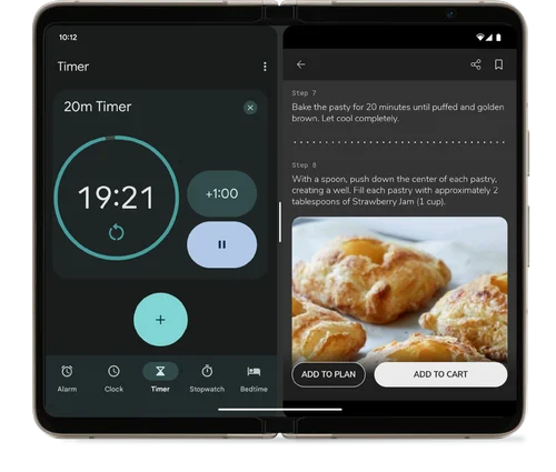
Cooking and grocery shopping app SideChef has a library of over 20,000 recipes with step-by-step instructions to help you plan your meals throughout the week. You can order fresh ingredients straight from the app and even search for recipes using ingredients to make the most of whatever you have in your cupboards.
There’s a lot going on in SideChef, so navigating through multiple menus is common practice for users. Interestingly, with the shift to a big-screen design, SideChef doesn’t spread these menus out over both panes to lighten the load. Cooking is already a multitasking nightmare, so the new layout for foldables and tablets focuses on keeping everything you need all in one app.
SideChef’s right pane will show pretty much everything users are familiar with. However, the left pane will feature a host of useful prep and planning tools for the kitchen including, setting timers, a stopwatch, and even a calculator to help with converting measurement units. The new layout brings everything into one place and makes the hassle of following a recipe a little less of a chore.
Outlook
Google’s efforts to make full use of the screen space available on its larger devices are commendable, and go some way to differentiating its devices from just being “bigger phones.” Optimized and tailored software will, no doubt, sway many users to pick up a Pixel Fold or Pixel Tablet after seeing the impact the larger panel can have on popular apps. Especially if these apps bring a unique sense of identity to Google’s products.
I can’t wait to see other apps take advantage of the additional screen real estate on offer from Google’s latest devices, and maybe even break away from Google’s design principles and great super creative with the space on hand.
Let’s keep our eyes peeled on the Google Play Store and see how those extra pixels can shape the future of apps on Android.
Source link
 notebook.co.id informasi dan review notebook laptop tablet dan pc