Google’s Pixel Tablet is the hot new slate on the block, and it might just be giving me doubts about my iPad Pro. That’s not to say that Google’s device is inherently better than my iPad Pro, just that there are some things about it that I envy as an iPadOS user.
My iPad Pro has a new lease on life after recently reviewing Plugable’s UDS-7IN1 Docking Station — a device that made me appreciate my iPad Pro a lot more as a powerhouse of productivity. It really brought out the best in Apple’s device and helped me transform my slate into a teeny-weeny workstation. But part of me is still conflicted.
No matter how much better it might be, how much more powerful, or how much more potential it has, there are just a few things missing — and I know exactly where to find them. These are the 5 Google Pixel Tablet features that make me regret buying an iPad Pro.
1. The Google Pixel Tablet Dock
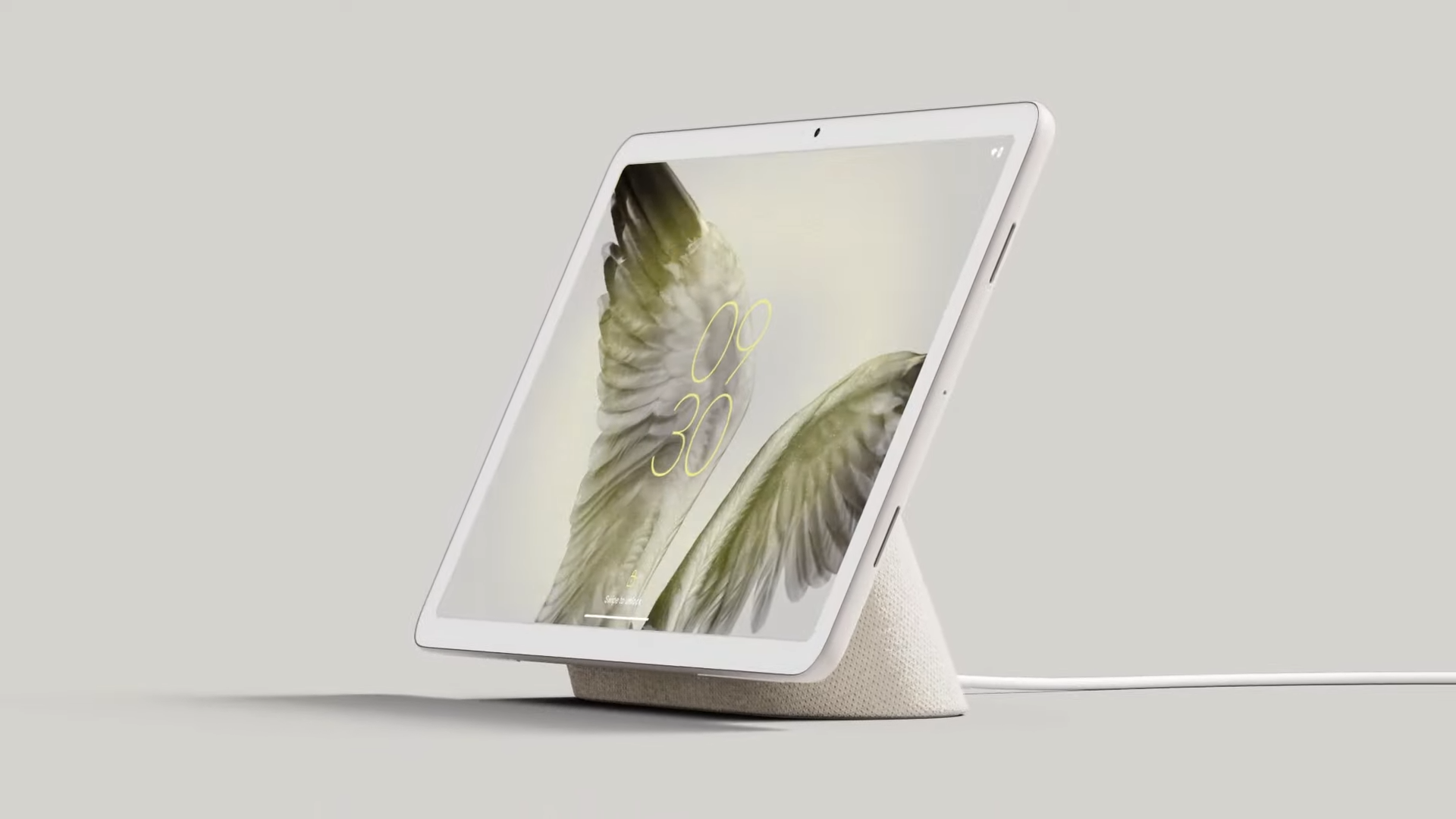
At the risk of being misread, I love a good dock. They’re pretty great. In fact, I recently reviewed Plugable’s UDS-7IN1 Docking Station — and it’s a device that made me appreciate my iPad Pro a lot more. But the Pixel Tablet’s dock has been living rent-free in my head ever since it was revealed. It’s nothing to do with cable-free charging or superior audio from the dock’s built-in speakers, it’s the Pixel Tablet’s ability to turn into a smart-home-styled hub when docked that I find most compelling.
I quite like the idea of nesting Google’s slate into its dock on my bedside table and having all of my WiFi-enabled furnishings on hand, or maybe a nice little clock and a preview of the weather. I’m sad like that — but it’s true. Throw the word smart in front of something and I’m all over it like a rash. I love smart things — probably because I’m dumber than a bag of glue-sniffing rocks.
Apple announced a similar function for iOS 17 called StandBy mode that transforms your smartphone into a digital alarm clock, calendar, or photo frame. Bafflingly the same feature didn’t find a home on iPadOS — even if the bigger screen seems like the more obvious candidate for such a feature. Instead, we’ll likely have to wait for WWDC 2024 to see the feature arrive on iPads. Or I could just have the full experience right now on Google’s Pixel Tablet. A year is a long time to wait, after all.
2. Android customization
I’ve got nothing against Apple’s design ethos when it comes to UI, I appreciate a clean and modern interface as much as the next guy — but I love being able to put my own stamp on things too.
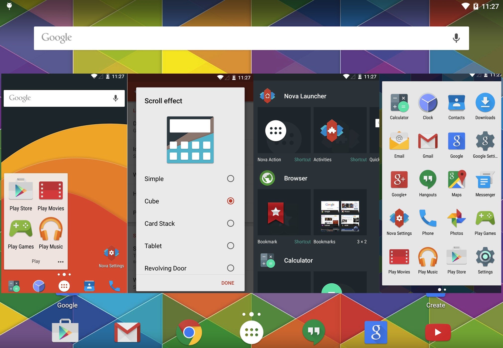
If you’re willing to invest a sizable portion of your time, you can just about manage some impressive visual customization on iPads in terms of icons, widgets, and backgrounds. However, most of that involves sneaky, time-consuming Shortcuts configurations. It’s customization, sure. But it doesn’t hold a candle to the type of customization afforded to you on Android devices.
Alternate launchers like Nova Launcher, Apex Launcher, and Smart Launcher 6 offer deep customization options that can completely overhaul the look and feel of your device. Android launchers allow you to change just about everything on your home screen from font types, font colors, icon styles, and icon sizes, even giving you the option to implement touch gesture shortcuts to your favorite apps.
Your tablet may have rolled along the same production line as everyone else’s, but with such incredible customization at hand, you can tailor your Android experience exactly how you’d like it, giving your device a unique identity that feels distinctly yours.
3. The full Gboard experience
Google’s popular keyboard alternative Gboard is available on iPad, and it’s… Alright? It’s definitely not the Gboard I’ve grown to love on my Android phone, that’s for sure. Gboard for iPad is a nerfed experience, devoid of all of the quirky character that Google’s keyboard has to offer — not to mention the vastly improved clipboard function.
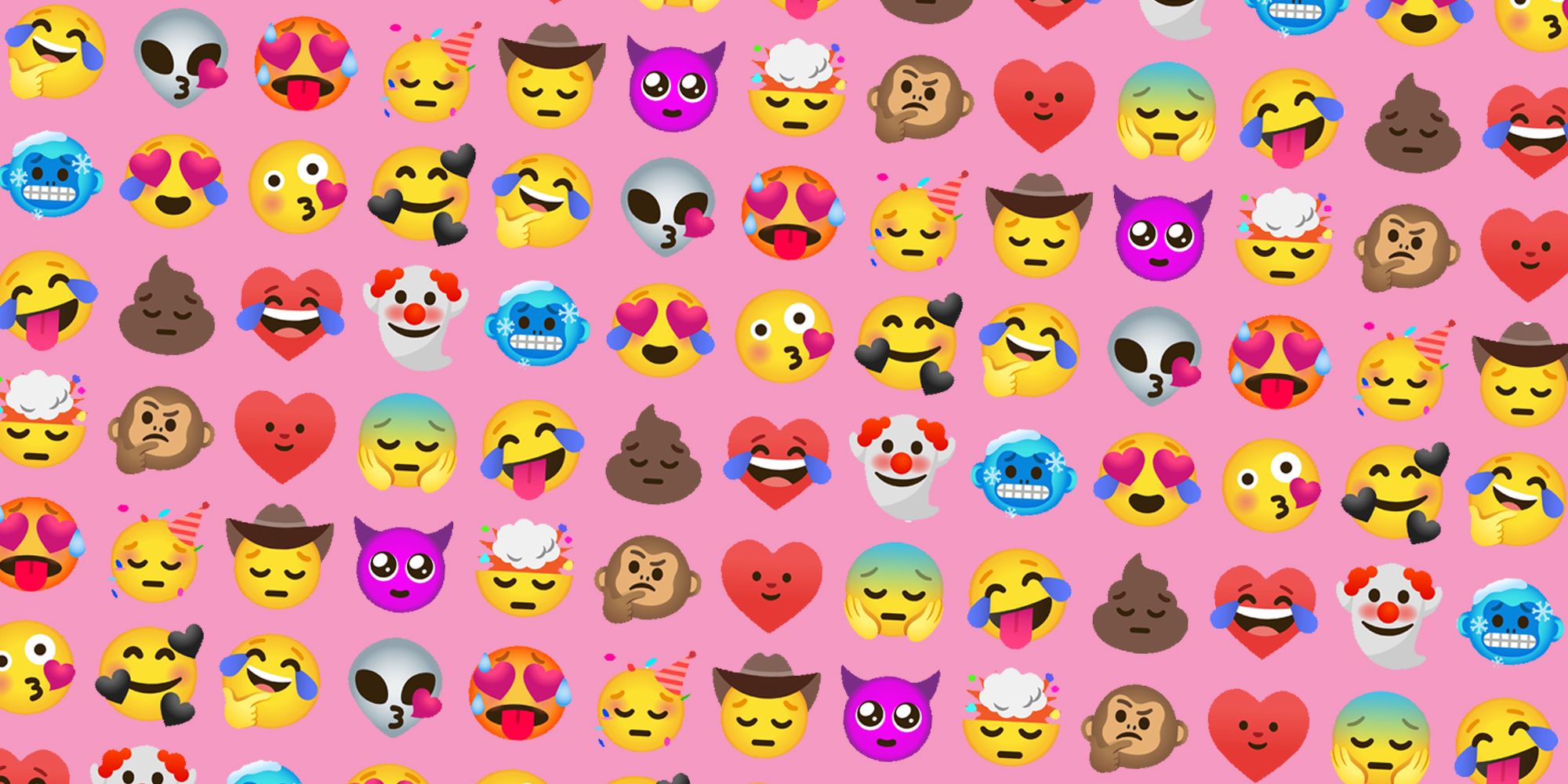
The biggest offense for many is likely the lack of Gboard’s split keyboard feature, which spaces both halves of the keyboard to the furthermost edges of the screen, allowing you to type with ease while holding a larger device like a tablet. However, for me, it’s the lack of Gboard’s Emoji Kitchen, which allows users to blend together two emojis to create a sticker of variable outcomes.
Banana emoji + turtle emoji = turtle with a banana on its head sticker. It’s quite possibly the single best use of the silicon chip I’ve seen to date. This is what Ada Lovelace worked so hard to achieve. But you’ll only reach the pinnacle of technological invention on Android devices. Android devices like the Pixel Tablet. iPad emoji + heartbreak emoji.
4. More versatile multitasking
The iPad’s Split View is great in horizontal orientations, effectively cutting up your screen into two mini tablets for you to multitask with ease. However, turn it upright and things get a little more frustrating. You would assume that the iPad would adjust the split horizontally to maximize the area for each screen to work with — but you’d assume wrong.
Instead, the screen remains (now) vertically split, resulting in two awkwardly elongated windows that serve about as much use as a hammer made out of contact explosives. You can still pull off vertical multitasking, but it’s either about making do with a Slide Over windows or fiddling around in Stage Manager to get things lined up just right. It can be a little time-consuming and frustrating, exactly the type of issue you’re trying to avoid if you’re wanting to multitask in the first place.
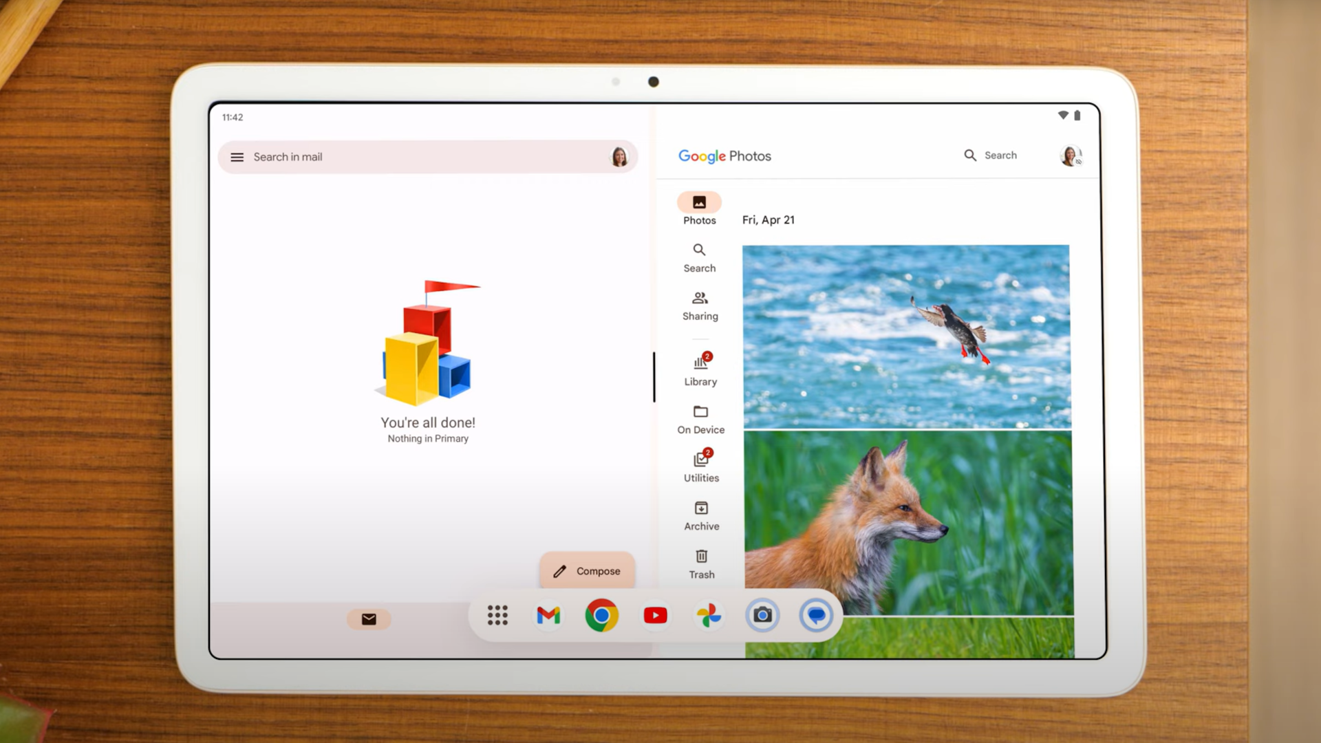
By contrast, the Pixel Tablet will appropriately split the screen in either orientation automatically, affording you maximum screen space for each pane. It’s just that simple. No mindlessly wrestling with apps in Stage Manager, just a long press and a quick tap. Why can’t everything in life be so simple?
5. WhatsApp for Android tablets
Can you believe that WhatsApp came to Wear OS before iPad? I can. Because it did. In fact, you still can’t get native WhatsApp support on iPad. The best iPad users can do is link up Safari to WhatsApp web. Even then you’ll miss out on key features like notifications for new messages.
In spite of WhatsApp’s huge popularity on iOS, the team behind the messaging app doesn’t appear to be in any rush to cater to the iPad crowd. The last word we heard on the service making its way to Apple’s slate comes from a January 2022 interview with WhatsApp boss Will Cathcart via The Verge. Cathcart said that much of the infrastructure for a native app on iPad is in place, though he wouldn’t commit to making any promises at the time. Swine.
Yet those with their grubby little mitts on a Pixel Tablet are already enjoying the world’s most popular chat app thanks to WhatsApp’s support for Android tablets. It’s even been optimized for tablets with a split-screen feature that displays your contacts and chats in individual panes for quick and easy access to multiple chats. They even get notifications. Notifications!
Oulook
I know much of what I’ve listed here is going to be irrelevant to some, and that’s more than fine by me. I know that a great many positives of the iPad Pro also outweigh many of the iPad cons that come along with it.
Am I going to ditch my iPad for a Pixel Tablet any time soon? Unlikely. But that doesn’t mean I can’t admire some of the things Google’s impressive slate has to offer.
Source link
 notebook.co.id informasi dan review notebook laptop tablet dan pc