Laptop manufacturers will do anything to stand out. Some will attempt to redefine the basics of a laptop’s design, like including a second display within the deck or turning a gaming laptop into a wearable accessory. Other companies will shift their product into an eco-political statement, approaching each angle of its manufacturing process with environmental consciousness.
Sometimes, laptop companies make tiny gestures to distinguish themselves from other brands, like the iconic trackpoint seen on business laptops like Lenovo’s Thinkpad series. Companies have their own unique keyboard layouts, too, with designated function keys often related to company-specific software.
Are these just gimmicks? For the most part, yes, but they’re often harmless and some changes can make waves throughout the industry. Laptops can be an endless slog of similarly designed black, silver, and gray models, so it’s hard to push against designers making bold, new choices. However, a company can go too far.
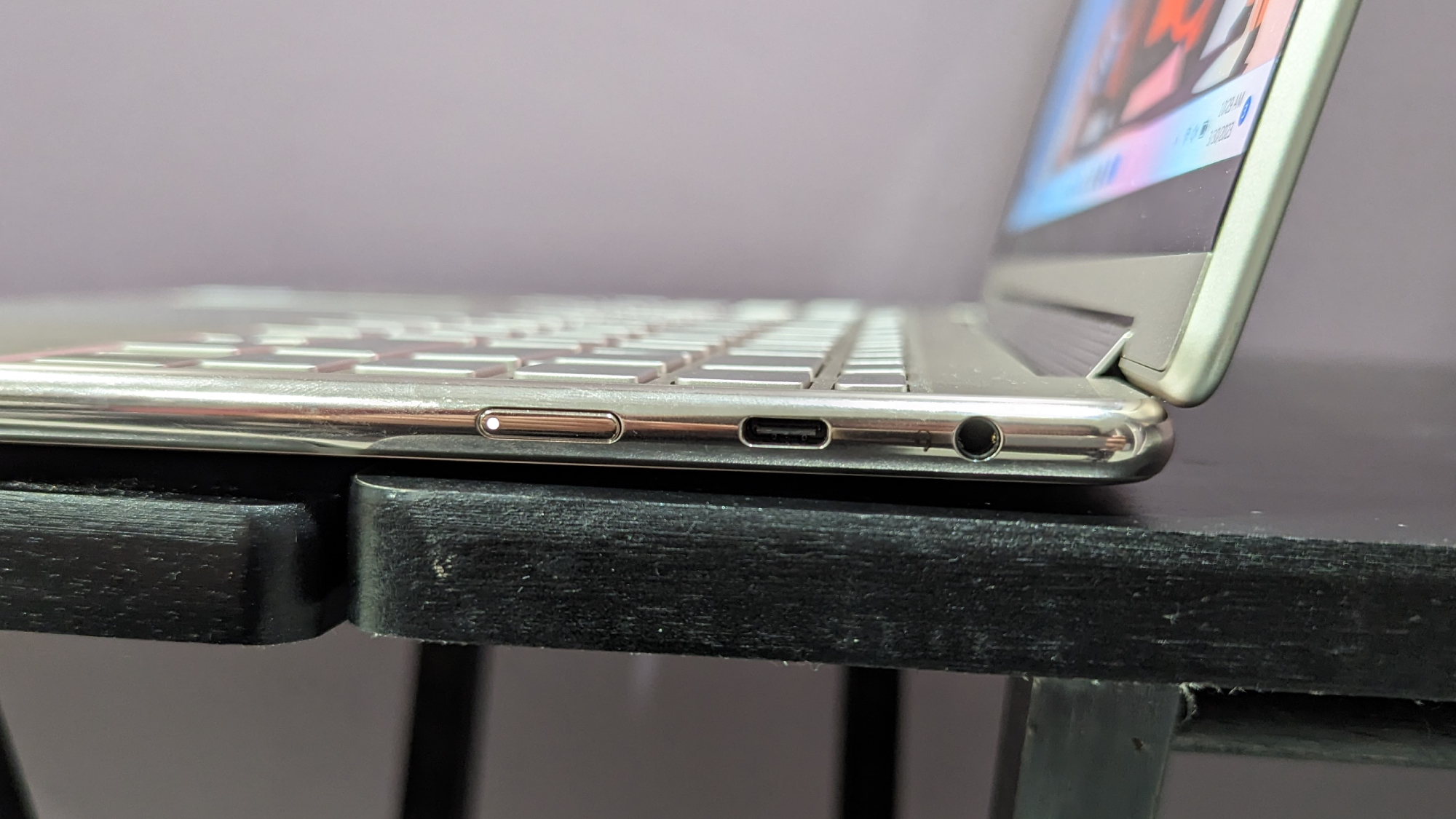
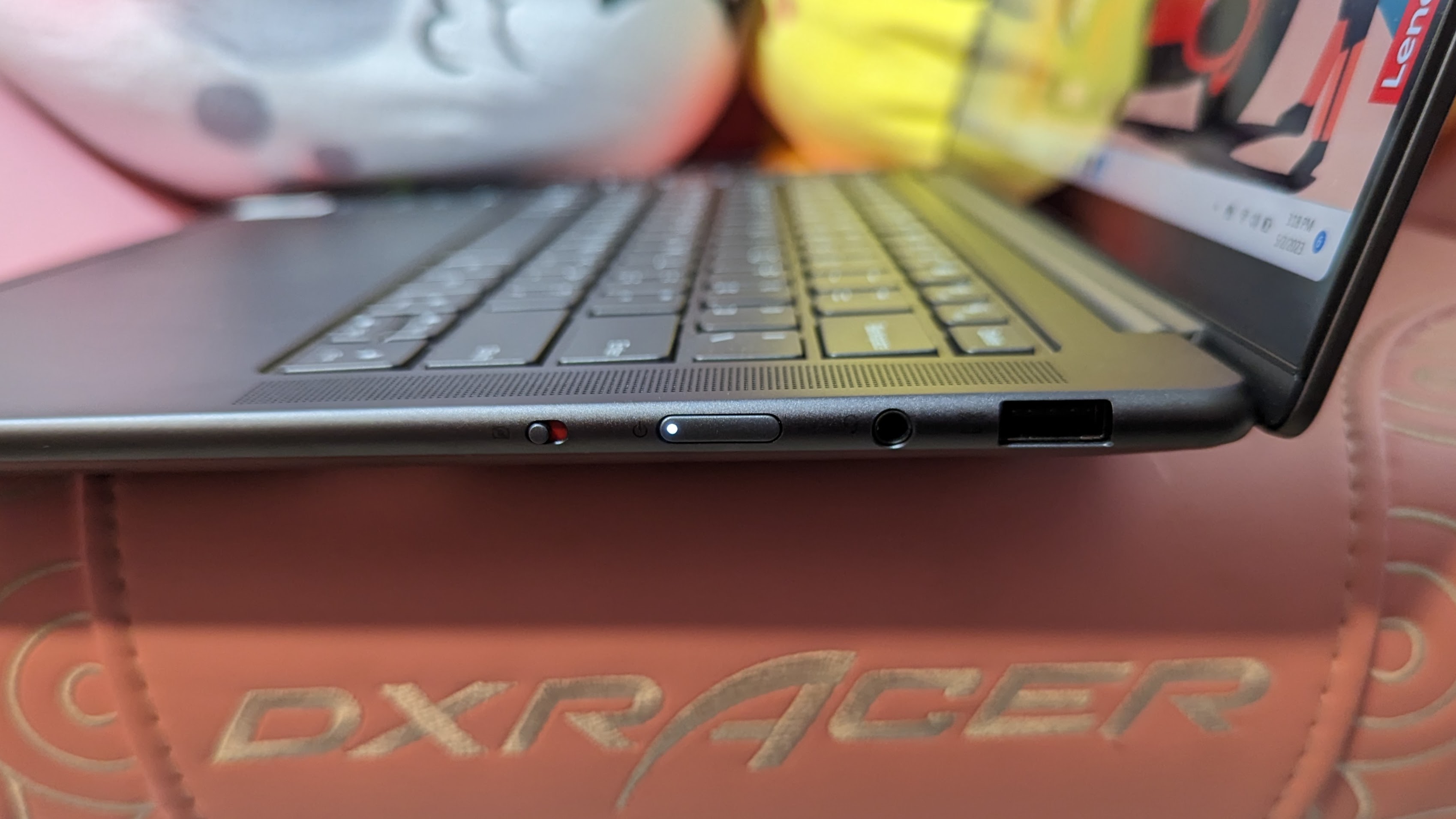
Have you ever lifted the lid of your new laptop and found that you couldn’t even figure out how to turn the thing on, catapulting you onto an epic quest to solve the cosmic puzzle of the missing power button? If not, count yourself lucky, as it’s becoming increasingly common for laptops to place their power button on the side of the chassis.
While this may be a petty nitpick, the trend absolutely sucks. Putting something as vital as the power button away from the user’s sightlines is silly. The situation isn’t so simple, as laptop manufacturers often have a reason to do this, but the execution needs serious work.
If you’re wondering why so many laptops place the power button on the side, it’s typically because they are a 2-in-1 or convertible laptop, meaning they can be transformed into tablet mode. When this happens, the keyboard is no longer accessible and the only thing in view is the screen itself.

Sticking the power button on the side of the laptop ensures the user can access it from any posture, which is admittedly a good idea. It could also free up space on the deck and allow for other keys to exist in its place, although that’s not a huge issue as some laptops place the power button above the keyboard.
But this idea is only good on paper. The first time I tested the Lenovo Yoga 9i, I spent 15 minutes perplexed by its lack of a power button. Googling questions on how to turn this laptop on, I eventually learned that the power button is on the right rim.
That experience was enough to burn me, but now even knowing where it is, I still struggle trying to feel around the side every time I need to turn it on. It’s not quite prominent enough to make it obvious when I’m feeling against it, and there’s been a few times where I’ve pushed against the side of the deck with no feedback, as I was actually just pressing against the metal.
I would understand the necessity for a feature like this if every spot on the keyboard was too vital to include an additional power button. But on the Lenovo Yoga 9i, F12 also functions as a dedicated key to open the calculator app. I don’t understand why this exists, but it’s as if the company ran out of ideas on what its function keys should do and just decided a calculator was fine. Would it hurt to include a second method for something as vital as powering on?

The Lenovo Yoga 9i isn’t the worst offender in this case, as laptops like the Lenovo Slim Pro 7 also stick the power button at the side even though it isn’t a 2-in-1 laptop. If this design philosophy primarily exists for convenience in tablet mode, what reason could there possibly be for it on a standard laptop? Is it just to save space on the deck, or have some companies genuinely fallen in love with this style?
It’s hard to deny that placing an important button out of view from the consumer is a strange idea. Not only does it make someone’s first time using a laptop like this a bit frustrating, but it continues to be bothersome every time you turn it on or off. This isn’t severe enough of a flaw that I would dock points from a laptop that employs it, nor would I belabor the point during a review, but it’s a seriously flawed concept.
Bottom line
Dear laptop manufacturers, if the laptop you’re building is not a 2-in-1, do not stick the power button on the side of the chassis. If it is a 2-in-1, consider including an additional method of turning on the power within the deck. And if that’s not possible, ensure the power button at the side is easy to find by touch rather than making me play a game of “Spot the Power Button.”
No one is going to turn their laptop to the side to check the power button’s location, so use a different material, make it bolder, give it a distinct texture — anything to make it obvious. I understand the occasional necessity for placing the power button on the side, but it should be as easy to use as the average power button.
Source link
 notebook.co.id informasi dan review notebook laptop tablet dan pc