The new iPhone 15 brings several premium specs to Apple’s entry-level flagship. However, many of those additions, like the Dynamic Island and the slightly brighter screens, are incremental or cosmetic rather than substantial upgrades to the iPhone experience — even when pitted against a two-year-old iPhone 13.
Besides, Apple omitted several key features that have been standard in the iPhone 15’s price range such as a higher refresh rate, quicker charging speeds, and the action button, which are now expected to trickle down to its successor next year.
Side by side, there’s not a whole lot setting the iPhone 15 and the iPhone 13 apart. In most scenarios, the differences in the iPhone 15’s improved camera quality and performance are negligible. Some may even prefer the iPhone 13’s solid hues over the iPhone 15’s muted, pastel-esque color options, and the former’s Lightning port so that they don’t have to bin their existing accessories without a dongle.
So should you pick the now-discounted iPhone 13 over an iPhone 15 and save a couple hundred bucks? Or, if you already own one, should you upgrade? Here’s what we found in our in-depth comparison.
iPhone 15 vs iPhone 13: specs
| Row 0 – Cell 0 | iPhone 15 | iPhone 13 |
| Size and weight | 5.8 x 2.81 x 0.3 inches, 6.03 ounces | 5.77 x 2.8 x 0.3 inches, 6.14 ounces |
| Display | 6.1-inch, 1179 x 2556, OLED, 60 Hz, HDR, 2000 nits peak brightness | 6.1-inch, 1170 x 2532, OLED, 60 Hz, HDR, 1200 nits peak brightness |
| Processor and RAM | Apple A16 Bionic (4 nm), 6GB RAM | Apple A15 Bionic (5 nm), 4GB RAM |
| Storage | 128/256/512GB | 128/256/512GB |
| Battery | 3349 mAh | 3240 mAh |
| Charging speeds | 20W USB-C wired, 15W wireless (MagSafe), 7.5W wireless (Qi) | 20W Lightning wired, 15W wireless (MagSafe), 7.5W wireless (Qi) |
| Authentication | Face ID | Face ID |
| Rear camera | 48MP wide + 12MP ultra-wide | 12MP wide + 12MP ultra-wide |
| Front camera | 12MP | 12MP |
| Color options | Black, Blue, Green, Yellow, Pink | Starlight, Midnight, Blue, Pink, Red, Green |
iPhone 15 vs iPhone 13: design and build
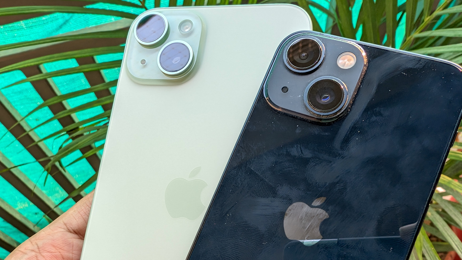
The iPhone 15 inherits the same design Apple debuted way back on the iPhone 12: glass on the front and back held in place with an aluminum frame and a protruding housing on the rear’s top left corner for the camera system. But there are a couple of notable tweaks that make the iPhone 15 more comfortable to hold.
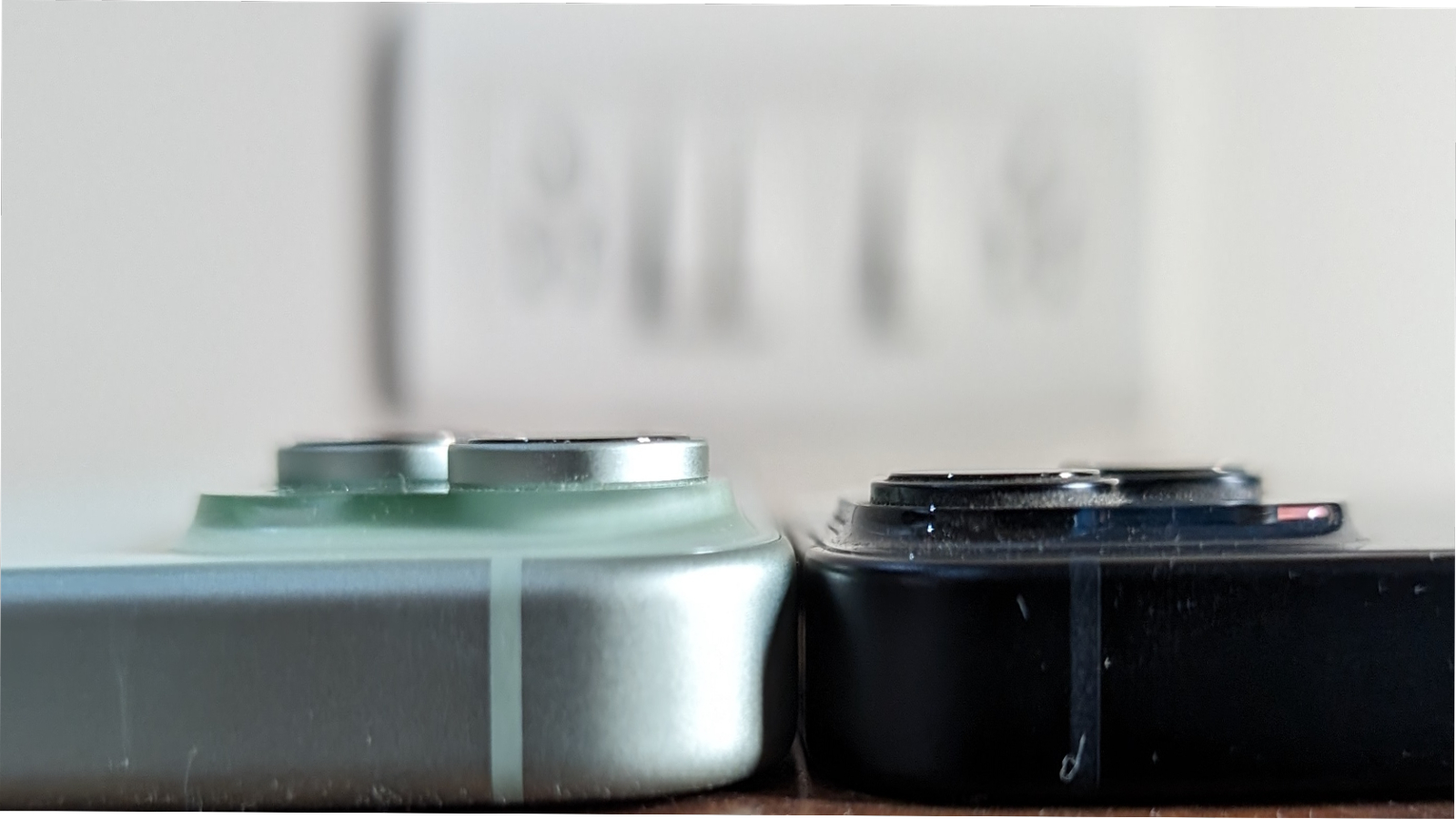
The edges, for starters, are a tad contoured as opposed to the iPhone 13’s sharp squared-off ones that can feel like they’re biting into your palm over prolonged use. More importantly, the iPhone 15 features a new, “color-infused” glass on the back, which has a smooth matte finish. Instead of a solid color, Apple has chosen to infuse it throughout the back of the iPhone 15. The result is a set of faint shades you may or may not like. In fact, on variants like blue, you can barely notice the color now and it looks nearly white.
Whether that’s a win or not depends on your preferences. Personally, I’m a fan. It’s a unique approach and, especially given that the camera module has a darker tint, it contrasts well with the rest of the lighter gradient.
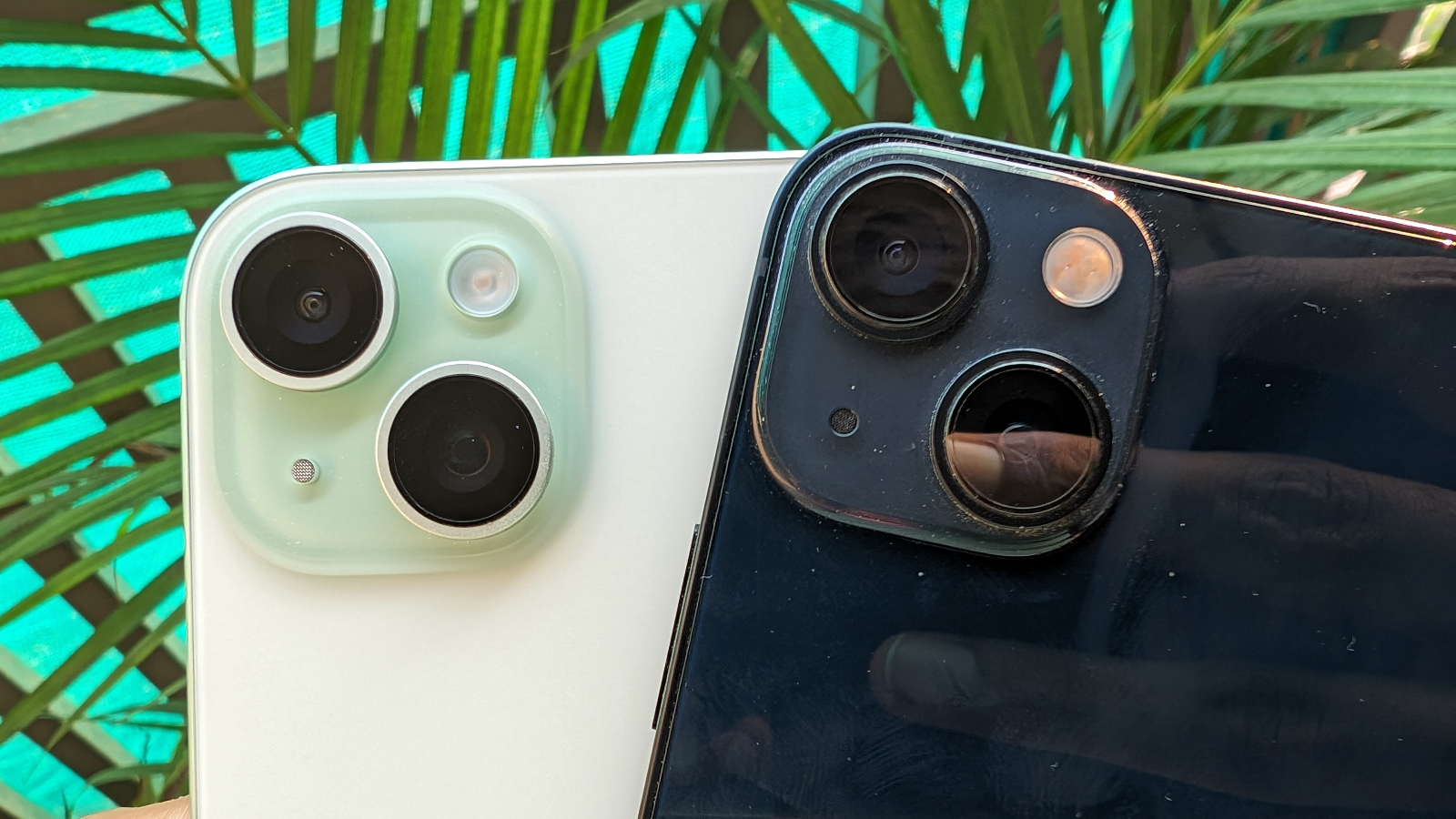
While the iPhone 15’s polished texture feels nice, it’s a double-edged sword. On one hand, it doesn’t attract nearly the amount of smudges that tend to stick to the iPhone 13’s glossy rear. On the other, the absence of that tactility makes the iPhone 15 far more slippery and undoes the edge’s improved ergonomics. Another downside of the iPhone 15’s design is that its camera bump protrudes further out and therefore, it wobbles a little more than the iPhone 13 when placed down.
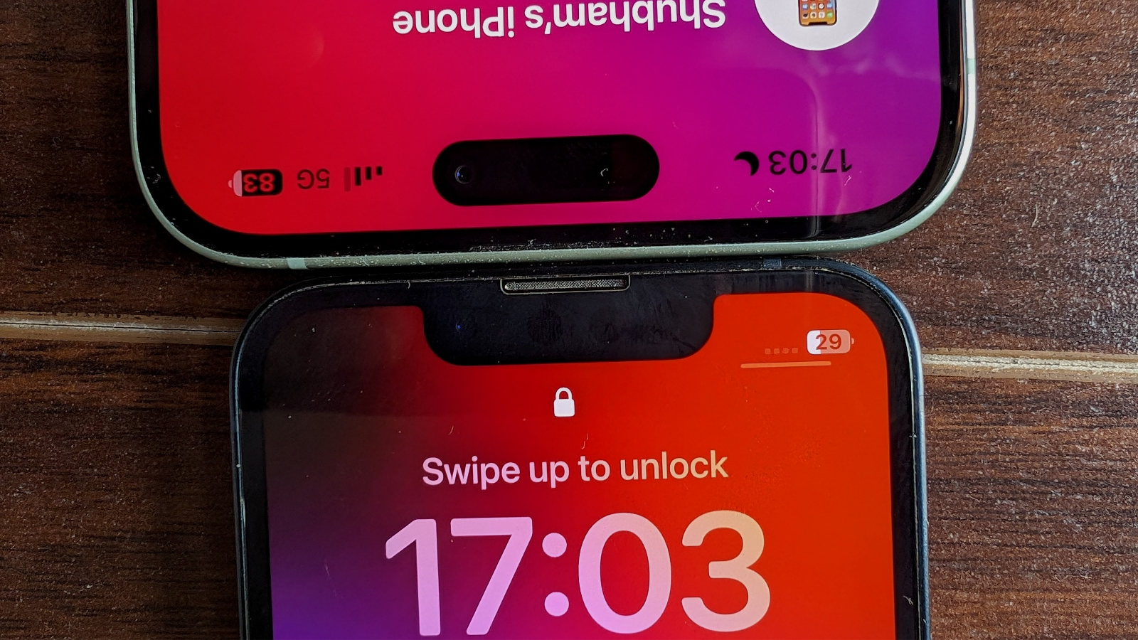
While the screen is off, you’d be hard-pressed to tell apart the iPhone 15 and the iPhone 13 from the front. Switch it on, however, and you’ll notice they sport different notch styles. The iPhone 15 offers what Apple calls a “Dynamic Island,” an interactive pill-shaped cutout that not only does a better job of concealing the Face ID sensors underneath it, but also elongates into the larger, main screen to project live activities like how far out your cab is, or the remaining times on your stopwatch. You can even touch it to expand it and access controls such as the option to shut down the timer or pause your music.
In its idle state, Dynamic Island also consumes less space than the iPhone 13’s traditional notch but it is placed lower, meaning the status bar is taller. If an app hasn’t been optimized to support the Dynamic Island, that means losing more screen real estate than the notch. The good news is, since it was released last year on the iPhone 14 Pro series, there are barely any apps that don’t support it.
Winner: Draw
iPhone 15 vs iPhone 13: display
Both phones have an identical Super Retina OLED screen and a full-HD resolution. They are sharp, vibrant, and support HDR as well as Apple’s True Tone tech – which automatically adapts the display’s temperature to your room’s ambience. However, in the iPhone 15’s case, you have two screen sizes to choose from: 6.1 and 6.7 inches, whereas the iPhone 13 is limited to 6.1 inches since Apple discontinued the 13 mini.
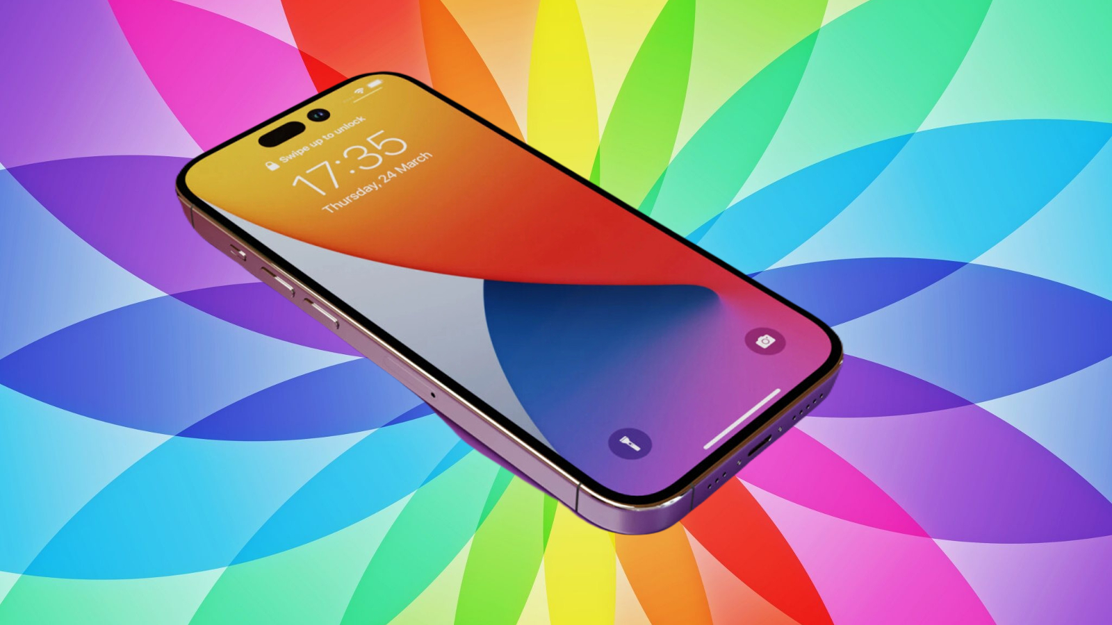
The iPhone 15’s screen is also more vivid and can achieve a peak outdoor brightness of 2,000 nits — nearly double that of the iPhone 13. While in day-to-day activities this difference won’t matter, it will come in handy if you spend more time outside. Under direct sunlight, at say, the beach, text on the iPhone 13 is still readable, but you’d have to focus your vision for it. On the iPhone 15, however, the screen can get so bright you’d think you’re indoors.
Winner: iPhone 15
iPhone 15 vs iPhone 13: ports and connectivity
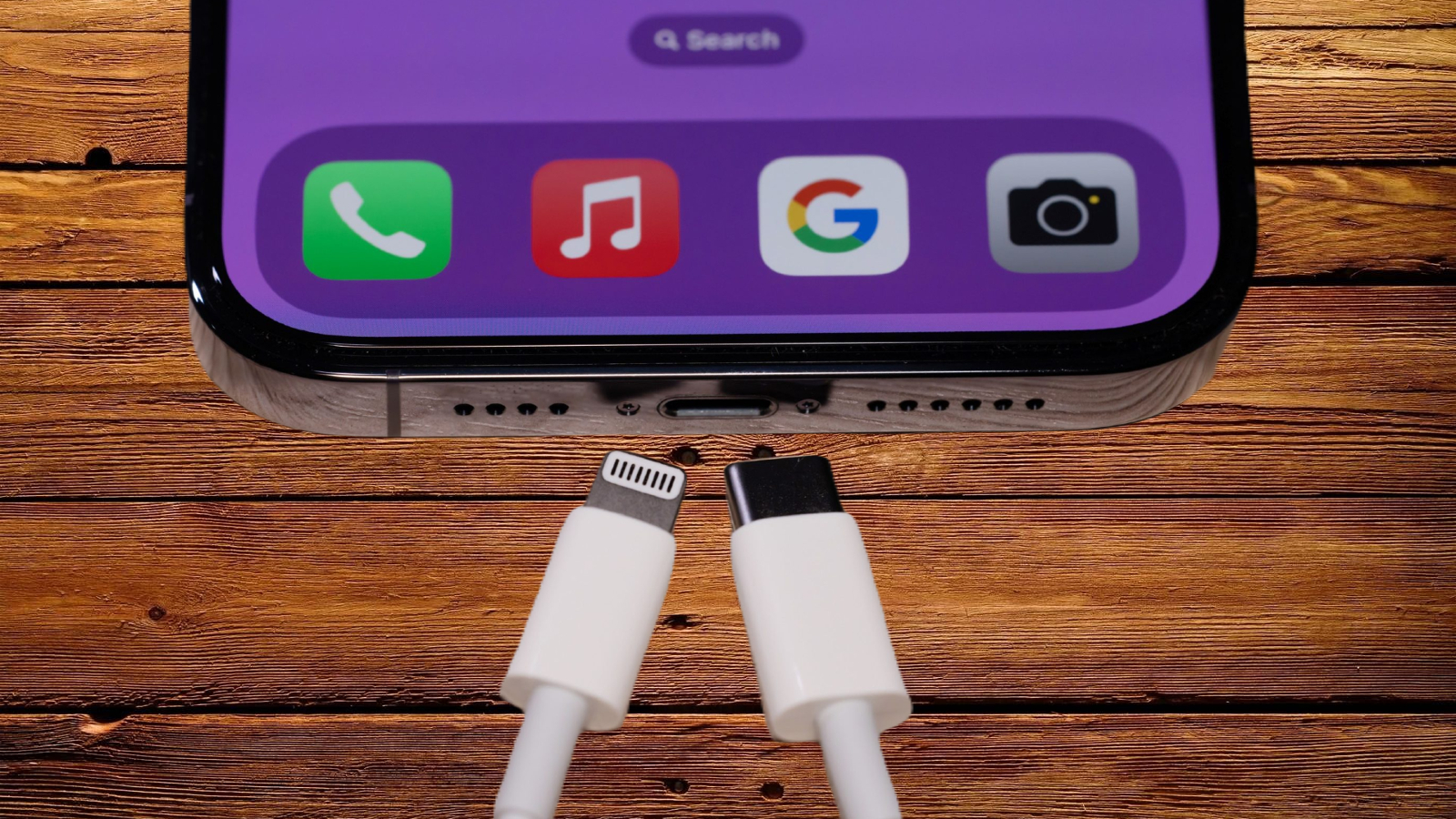
One of the most vital quality-of-life upgrades the iPhone 15 offers is it replaces Apple’s proprietary Lightning port with USB-C. It’s a universal connector you’ll also find on several other Apple products like the MacBook or the iPad, and its arrival on the iPhone finally eliminates the need for you to carry multiple cables. That said, Apple hasn’t enabled higher data transfer speeds on the iPhone 15 (unlike its Pro counterpart) and it supports the same USB 2 standard as the iPhone 13.
While the iPhone 15’s USB-C port is convenient, it can prove to be a hassle if you own numerous Lightning accessories. A $29 adapter can let you continue to use them, but you’ll have to live with the hassle of carrying it around everywhere. The USB-C does have its own perks, however: it’s compatible with far more peripherals like external displays and portable storage devices.
In addition, the iPhone 15 allows you to connect to emergency and road assistance services via satellite when you’re stuck in places without mobile connectivity. Its upgraded sensors can also detect if you’re in a “severe” car crash, and automatically call for help.
The iPhone 15’s hardware upsides don’t end there. Its second-gen ultra wideband chip and improved Bluetooth help you precisely find your Find My accessories and friends at over 3-4 times longer distances than the iPhone 13. This bump-up is noticeable in real life too: I tried to locate a hidden AirTag inside an office and the iPhone 15 began to offer me precise directions much further out.
The iPhone 13 does hold one advantage. It has a physical SIM tray alongside support for eSIM. In the United States, the iPhone 15 is only compatible with eSIMs.
Winner: iPhone 15
iPhone 15 vs iPhone 13: performance and battery life
The iPhone 15 runs on a superior A16 Bionic chip and houses an extra 2GB of RAM (6GB vs 4GB). While both phones’ processors are powered by a 6-core CPU and a 16-core Neutral Engine for on-device intelligence, the A16 has an additional core inside its GPU and it has 50% more memory bandwidth. In Geekbench tests, the iPhone 15 scores were about 10% higher.
As the benchmark results suggest, there’s not much separating the two. Each performs well in day-to-day tasks and I’m yet to face a stutter on either of them – even when I try to multitask between resource-intensive tasks. Despite the GPU benefits, the iPhone 15 isn’t remarkably better at video games except for loading titles like Asphalt 9 a few seconds quicker, and it can’t render AAA games, unlike the 15 Pro.
The iPhone 15’s CPU consumes 20% less power and that shows in its endurance. Though both phones can comfortably last a routine day on a single charge, you can get an hour more screen time out of the new iPhone 15. In real-life use, that can translate into a couple of hours of additional battery life. The iPhone 15 Plus, on the other hand, easily clocks about six hours of screen time, and can go on for a day and a half.
Charging speeds are identical as well. Over wired connections, a 20W adapter can top up the iPhone 15 and the iPhone 13 to 50% in nearly thirty minutes. Both are also compatible with 15W charging over MagSafe and 7.5W on Qi wireless chargers.
Winner: iPhone 15
iPhone 15 vs iPhone 13: cameras
The area where you can really get your money’s worth on the iPhone 15 is its camera. It features improvements across the board, from a higher-res main sensor to sharper zoomed-in shots.
The iPhone 15 swaps out the 12-megapixel primary lens that’s been on Apple’s default flagship since the 6S for a 48-megapixel camera. The ultra-wide, though, is identical to the iPhone 13: a 12-megapixel f/2.4 with a 120-degree field of view. The iPhone 15’s 12-megapixel selfie camera has a larger f/1.9 aperture and can capture more light in low-light conditions.
The iPhone 15 also gains a couple of handy software tricks: it automatically grabs the depth information in the default photo mode so that you don’t have to manually switch to Portrait, and can choose to turn the normal photo into a Portrait later in the Photos app. Plus, it leverages the main sensor’s ability to capture a larger volume of pixels to digitally replicate a physical telephoto lens and offer a much cleaner 2X zoom.
Under ample lighting, it’s hard to spot the iPhone 15’s camera boosts. Photos and videos taken on both the iPhone 15 and iPhone 13 are well-lit, plenty sharp, and feature a decent balance of highlights and shadows.
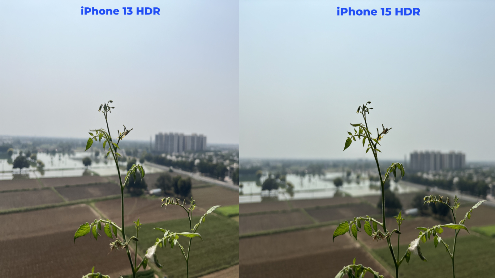
However, when I transferred some of those shots onto a larger screen, I did see the iPhone 15’s fifth-gen Smart HDR (as opposed to the 13’s fourth-gen) at play. It equally brings out your scene’s background and foreground. The iPhone 13, in comparison, tends to blow up the highlights and focuses more on emphasizing the subject. Plus, since the iPhone 15 is equipped with Apple’s Photonic Engine, it better retains the scene’s original texture, skin tones, and color, especially in the Portrait mode, where the subject’s details are even further accentuated.
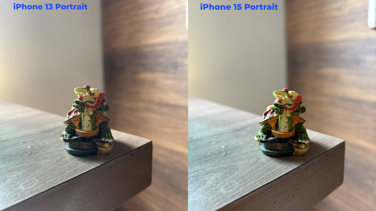
The effects of the Photonic Engine — which takes numerous uncompressed images before your actual shot to gather more information about what you’re clicking — paired with the iPhone 15’s higher-res camera are most highlighted in low-light scenarios.
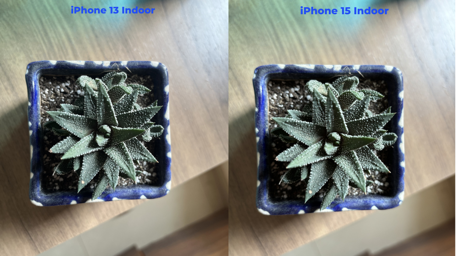
Whereas the iPhone 13 struggles to keep indoor nighttime shots (like at a bar) from turning out grainy and out of focus, the iPhone 15’s outcomes are richer in detail and far often less blurry.
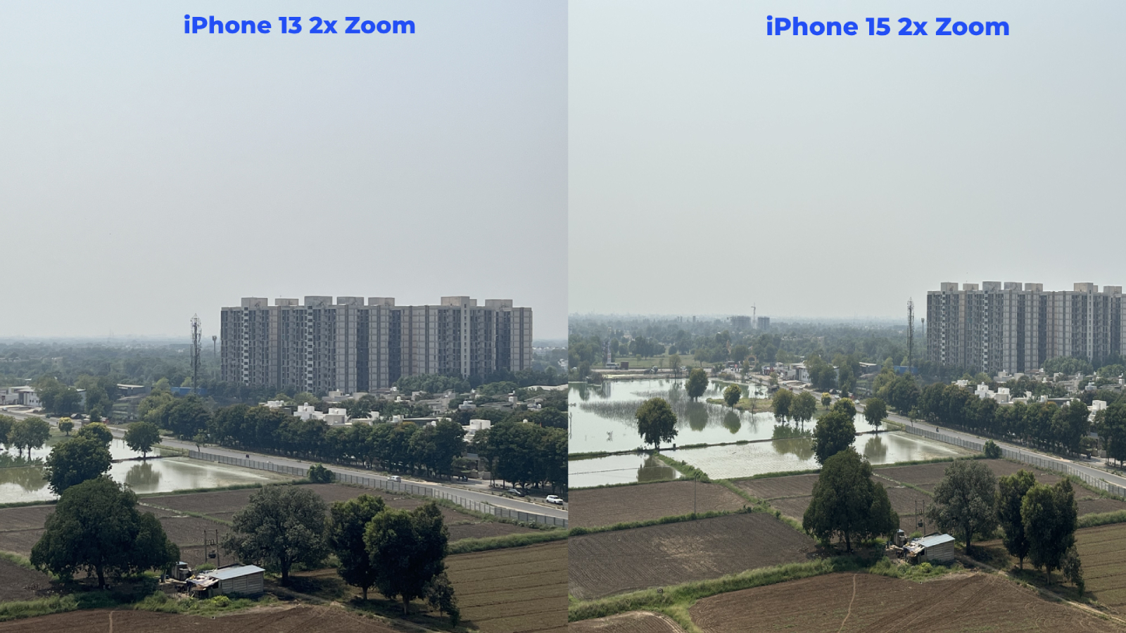
Because you can shoot pictures in a much higher resolution on the iPhone 15, you also have more room for edits later. On top of that, while the iPhone 15’s 2X zoom is still no match for a dedicated telephoto lens, it produces sharper images than the iPhone 13.
Videos taken on both phones are largely similar, but the iPhone 15 has two clear advantages: its 48MP camera produces fewer lens flares at night, and offers Action Mode, which keeps your videos steady even when you are moving.
Winner: iPhone 15
iPhone 15 vs iPhone 13: verdict
The iPhone 15 is objectively a more capable phone than the iPhone 13. However, apart from the camera, and perhaps the USB-C port, none of its upgrades are particularly significant.
If you’re looking to buy a new iPhone, I’d say the $200 difference is worth it. It will receive software updates at least two years longer than the iPhone 13 and the USB-C port will prove handy as Apple phases out Lightning. However, if you’re looking to upgrade from the iPhone 13, the iPhone 15 won’t be that big of a jump in experience. For that, I’d recommend waiting for the iPhone 16.
Source link
 notebook.co.id informasi dan review notebook laptop tablet dan pc